
Design system
Liquid glass on gloss black.
Everything on these pages comes from one logo, glass letters in green and orange on a glossy black tile, and this page is the rulebook for the real build.

- Glass green
--green - Glass orange
--orange - Gloss black
--ink-0
The mark
Glass letters for dark surfaces. The tile for everything else.

mark-720 720 by 403
tile-640 640 by 640- Letters only on dark surfaces. They are clear glass. They need black behind them.
- Use the tile on light or busy surfaces. It carries its own black.
- Keep clear space around it. The space equals the height of the letter L, on every side.
- Never recolor, stretch, outline or add effects. The glass is the effect.
Do not
-
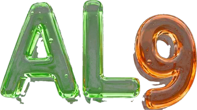
Do not stretch it.
-
Do not recolor it.
-
Do not put the letters on a light surface.
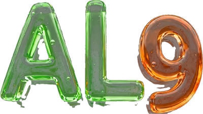
Still needed: the original artwork. The logo came from the founder as a JPEG, and every mark on these pages was cut out of that one file. The real build needs the original artwork file.
Files
mark-160mark-400mark-720The letters, on a clear background. Each one comes as.avifand.webp.tile-128tile-320tile-640The tile, with clear corners. Each one comes as.avifand.webp.favicon-32.pngfavicon-48.pngThe browser tab icon. Brighter letters on a black square, so it reads when tiny.icon-192.pngapple-touch-icon.pngThe same square for home screens, at 192 and 180.
Color
Green means search and go. Orange means the coin and getting paid. White is neutral.
- GreenSearch and go.
- OrangeThe coin and getting paid.
- WhiteNeutral. Everything else.
No other accent colors. If a new color feels needed, the answer is green, orange or white.
Surfaces
--ink-0#050605Base. The page itself.--ink-1#0a0c0aOne step up from the base.--ink-2#0f120fTwo steps up.--ink-3#161a16Three steps up.--ink-4#1e231eFour steps up.--ink-5#2a302aFive steps up. The lightest dark.
Lines
--linergba(255,255,255,.09)Hairlines. Card edges, dividers, table rows.--line-2rgba(255,255,255,.16)Stronger edges. Tiles, chips, fields.--line-3rgba(255,255,255,.28)The strongest edge. Hover edges, dashed tags, the check box.
Text
--text#f3f7f0Headings and main text.--text-2#c9d2c5Body copy, leads, chip labels.--text-3#98a294Quiet text. Captions, hints, table heads.
Green
--green#63d936The base green. Fills, step numbers, the selected tab.--green-hi#8cf060Green text on dark. Links, eyebrows, the focus ring.--green-pale#bdf5a5Text on green tinted pills.--green-deep#2c8a18The shadow side of the glass. Spare--green-ink#051402Text on green fills.
Orange
--orange#ff8a24The base orange. The coin, orange steps, solid pills.--orange-hi#ffa94fOrange text on dark. Amounts coming in, orange links.--orange-pale#ffd6abText on orange tints. The balance chip.--orange-deep#b3560bThe shadow side of the glass. Spare--orange-ink#1d0d00Text on orange fills.
Bone, white and danger
--bone#eef3eaThe light band.--white#fffPure white. The white button and hover text.--danger#ff6b5eErrors only. Field edges and error text.
Contrast
Every pair below clears 7 to 1, the strictest WCAG level for normal text. The numbers are worked out on this page, from the live tokens, with the WCAG relative luminance formula.
- Aa
--texton--ink-018.72 to 1AAA - Aa
--text-2on--ink-013.06 to 1AAA - Aa
--text-3on--ink-07.66 to 1AAA - Aa
--green-inkon--green10.39 to 1AAA - Aa
--orange-inkon--orange8.03 to 1AAA
Type
Three families, one job each. Heavy for headings, clean for reading, mono only for code.
-
Display
Get paid.
Gabarito
--displayHeadings and big numbers. Weight 800, set tight.
-
Text
Plain words, easy to read on a phone.
Figtree
--sansEverything else. Body copy, buttons, labels, fields.
-
Code
var(--green)Geist Mono
--monoCode and key caps only. Never for copy or labels.
The scale
Sizes flex with the screen. Each line below is set live with its token, and the pill shows its size on this screen right now.
Search.
Do business.
Get paid.
A card or group heading
The one sentence that sits under a headline.
Body copy. Seventeen pixels with room between the lines, so it reads on a phone held at arm's length.
Weights in use
- Aa400Figtree. Body copy.
- Aa500Figtree. Nav links, chips, typed text.
- Aa600Figtree. Small labels, toasts, the tab bar.
- Aa700Figtree. Buttons, pills, eyebrows, bold text.
- Aa800Gabarito. Headings and big numbers.
- Aa900Gabarito. The giant step numbers on the home page.
Small rules
- Heading tracking
-.012em- Heading line height
- 1.04
- Body line height
- 1.58
- Eyebrow
.78rem, 700, caps,.15emtracking- Numbers in columns
.numfor even digits- Line breaks
- Headings balance, paragraphs wrap pretty
Shape and space
Round like poured glass. Wide gutters. Sections that breathe.
Radius
--r-xs8pxSmall parts. Spare--r-sm12pxSmall controls. Spare--r-md18pxNotes and toasts.--r-lg26pxCards and steps.--r-xl38pxTiles.--r-pill999pxButtons, chips, pills, tabs, the tube.
Layout
--top 58px
--gut
--wrap 1180px
--gut
--tabbar 64px, phones only
--wrap- 1180px. The widest the content gets.
--gut- 20px. 32px from 760 px up.
--top- 58px. The sticky top bar.
--tabbar- 64px under 760 px. Zero above.
Mind the tab bar. On phones it covers the bottom 64 px of the screen. The body already pads itself by --tabbar. Anything fixed to the bottom has to sit above it.
Section rhythm
.sec clamp(56px,9vw,116px) .sec--tight clamp(40px,6vw,72px) Breakpoints
- 760 px
- Gutters grow. The tab bar leaves. Two column grids start. Sheets move to the middle.
- 900 px
- Three column grids, the split, and steps in a row.
- 1020 px
- The desktop nav shows.
- 1040 px
- Four column grids.
Surfaces
Dark is right. Flat dark is not. Every surface catches a little light.
Card
Soft glass. Lists, forms and quiet content.
.card .card--padTile
The glossy logo tile. A hard shine across the top.
.tileGreen tile
Lit from below in green. Search and go.
.tile .tile--gOrange tile
Lit from below in orange. The coin and getting paid.
.tile .tile--oThe page has its own light. The body sits on --ink-0 with three soft glows: white from the top, green from the left, orange from the right.
Bright bands. Every page gets at least one. On a band the text turns to dark ink, the eyebrow follows, and the focus ring turns black.
Green band
.band .band--green
Orange band
.band .band--orange
Bone band
.band .band--bone
Components
Every part below is the real class from the shared style sheet, running live.
Buttons
.btn .btn--green .btn--orange .btn--white .btn--ghost .btn--ink Green for go, orange for the coin, ink on bright bands. One primary button per screen..btn--sm 44 px .btn 50 px .btn--lg 58 px Switch one off with disabled or aria-disabled="true"..btn--blockLinks
.link .link--o .arrowPills and the sample tag
.pill .pill--g .pill--o .pill--solid-g .pill--solid-o .pill--line .sample The dashed tag marks made up data.Chips
.chips .chip .chip__n Selected with aria-pressed="true", aria-selected="true" or .is-on. Add .chips--scroll for one row that scrolls sideways, and give that row jump buttons. Sample countThe coin bead
.coin .coin--g .balance Sized in em, so it follows the text around it. Sample balanceCheck box
.check .check.is-badForm fields
.field .input .select .textarea .hint .field.is-bad .err Every field has a real label. Text sits at 17 px, so phones never zoom in.Tabs
.tabs .tab .tabs--o Both sets work. Arrow keys move, Home and End jump.The search tube
.tube This one is live. Tap in and it suggests. Add .tube--sm for the short one..suggest .suggest__o .suggest__foot The typed part stays plain, the rest goes bold. The key hints only show on screens with a mouse..tube.is-loading Liquid pours through the glass while the answer loads.Toast
.toast Fired from the shared script with toast(message, { coin: true }). It leaves by itself.Sheet
dialog.sheet .sheet__in .sheet__head Rises from the bottom on phones, sits in the middle on desktop. Escape closes it.Steps
Send the lead
The customer asked you to refer them.
It gets matched
A local business takes it.
You get paid
Coins land in your wallet.
Orange steps
For lists about the coin.
.steps .steps--row .steps--o Only for things that happen in order.Timeline
- Sent
You send the lead.
- Matched
A business takes it.
- Paid
Coins land in your wallet.
.timeline li.is-oMeter
.meter .meter__fill .meter--g Set the fill with --v. SampleSkeleton
.sk Holds the place of text that is loading.Key value list
- Lead
- Kitchen faucet repair
- City
- Los Angeles
- Payout
- 40 coins
.kv SampleTable
| Lead | City | Coins |
|---|---|---|
| Faucet repair | Los Angeles | 40 |
| Home buyer intro | Pasadena | 120 |
.table .r SampleNote
A green note. For rules and plain facts a visitor should not miss.
An orange note. For anything about the coin or getting paid.
.note .note--oSmall parts
.badge-ic .badge-ic--o .badge-ic--w .icon .eyebrow .eyebrow--o kbd .stat__n .stat__l Icons are inline SVG on a 24 box, stroke only, round caps. SampleMotion
Things arrive from all four sides, once, then hold still.
data-rv="up"data-rv="down"data-rv="left"data-rv="right"data-rv="zoom"Easing and time
-
--easecubic-bezier(.2,.7,.2,1)The default. Fast out, soft landing. Reveals, hovers, sheets.
-
--springcubic-bezier(.34,1.45,.5,1)A small overshoot. Toasts, the go button, the check mark.
--t-1.16s Hover and press.--t-2.34s Sheets, menus, toasts.--t-3.7s Long moves. Spare
The rules
- Transform and opacity only. Nothing that moves is allowed to push the layout around.
- Headings slide but never fade. Add
data-solidso the biggest words are there at once. - Everything respects reduced motion. The page tag gets
calmand all of it holds still, fully visible. - Loops pause off screen. And decorative motion lives under
.anim, never outside it.
Motion is off here. Your device asks for reduced motion, so nothing on this page moves. That is the rule doing its job.
Named moves
fade rise drop sink shimmer pour blink floaty spin
Voice
Confident and plain. A little street, never corporate.
Search. Do business. Get paid.
The brand line, straight from the founder's logo. Three short sentences. That is the whole voice.
- Short sentences.One idea each. Then stop.
- Plain words.Write it the way you would say it out loud.
- No dashes or hyphens anywhere.Not in copy, numbers, dates or lists.
- Say what a thing is on the first screen.A plain headline, one sentence, then the action.
- One clear action per screen.One primary button. Everything else stays quiet.
- Sample data is labeled.With the tag Sample or the word sample close by.
- Coins are counted in coins, never dollars.Write 40 coins. Never a price.
The name
ALGR
Written ALGR. Said like algorithm.
Write it like this
- sign in
- real time
- pay per lead
- one tap
- AI built in
- 3 to 5
- (213) 555 0142
Access
It has to work for a thumb, a keyboard and a screen reader.
-
Tap targets
At least 44 px tall and wide. The dashed box is the measured size of each one.
-
Focus ring
Two pixels of
--green-hi, three pixels out. Black on bright bands. Press Tab to see it for real.On darkOn a band
-
Text sizes
Body copy is 17 px. Fields are 17 px too, so phones never zoom on focus. Small labels stop near 11 px and stay bold.
17 px body11 PX LABEL
-
Reduced motion
The page tag carries
animorcalm, set before first paint. Undercalmeverything is visible and nothing loops.Checking this device
-
Labels on every field
A visible label, or a hidden one with
.srwhere the design has no room, like the search tube. Errors sit under the field in words. -
Landmarks
A skip link first. Then one header, named navs, one
mainand one footer. Dialogs trap focus and Escape closes them.
That is the whole system. Now see it at work.
Open the home page